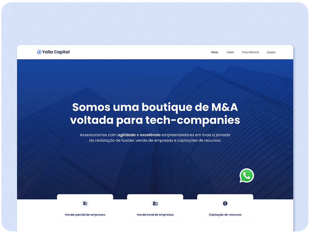
Yalla Capital Brand Identity & Website
BRANDING
CLIENT
YALLA CAPITAL
SERVICES
BRANDING | WEBDESIGN
PLATAFORM
WORDPRESS

Briefing:
Yalla Capital is a M&A company that came to us looking for a new visual identity for its brand. The company values ideas, capital and technology. its ideals are based on agility and excellence for its clients in Brazil and worldwide.
The Logo
We seek to rebuild an identity that represented the real values of Yalla Capital, such as agility, fluidity, excellence and modernity. Using the “Y” of Yalla and an arrow showing the constant movement of the company, and the circle including the 2 elements.


• The logo protection area must have a minimum distance of 50% from the height of the letter “Y”:

• The maximum reduction of the logo would be the size of 7×44 mm when in the horizontal version, and 24mm in the vertical version:

7×44 mm

24 mm
• The typography used for the Logo is “Poppins Semibold”, with -25 spacing between the letters.
• Brand colors

• Correct use of the logo on different backgrounds.
• Incorrect use of the logo on different backgrounds.
Final result


